Mobile Design and Development
The Way to a Customer’s Heart is Through Their Smartphone”
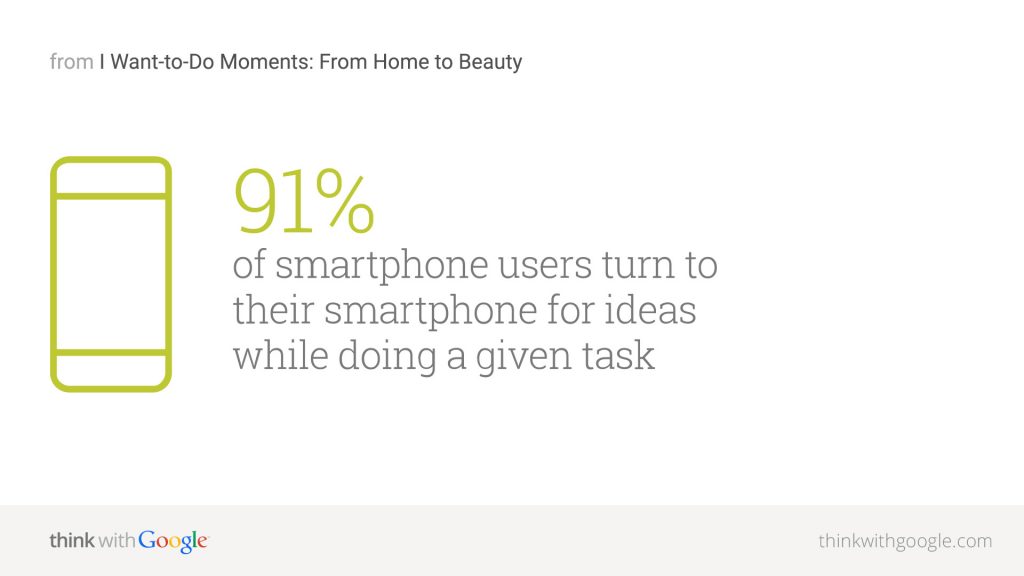
There are roughly 182 million smartphone users in the US. In just 3 years, that number will likely increase to 223 million (70% of the population). While you were sleeping, customers were making purchases via smartphones. Were they buying your products, or those of your competitors?

Traditional web design doesn’t work on mobile platform, with variables such as display size and user environments reshaping the way that content needs to be presented. We help companies translate their brands to mobile to increase revenue generation opportunities.
User Interface: Intuitive Mobile Surfing
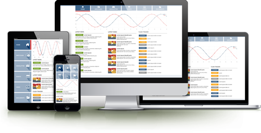
It is the way of making a single website that works effectively on both desktop browsers and on mobile devices. Responsive architecture gives the best quality browsing experience – whether on a smartphone, tablet, or e-reader, and regardless of the operating system.

People who browse while on-the-go have very different needs than those sitting at a desk. Responsive web design enables websites re-organize themselves automatically according to the device viewing them, so that the same website provides a great user experience everywhere. Desktops get a full-blown interface with videos, large images and animations. Smartphones get a simplified website that runs fast without the bells and whistles. Tablets get something in between.
Delivering an App-Like Experience.
Mobile environments require simpler navigation, focused content and fast page loads. If a website has a responsive design, the user does not have to manipulate the site using “pinch and zoom,” and the flow of content is more appropriate for a smaller screen. The site may reduce the amount of content presented to the mobile visitor, so it has less clutter and is easier to use.
Future Friendly
Responsive design is a forward-thinking technology, as it makes sites that will work on next year’s devices. One of the major challenges in providing excellent websites for the mobile user is the vast number of devices emerging in the market place. At the international Consumer Electronics Show “CES 2012” more than 40 new Android based mobile devices were released and this doesn’t include any devices running on other platforms like iOS, or windows mobile. It’s no longer possible to test your website on every one of these new devices.
Responsive design works by grouping similar devices by screen size together to establish the target size “break points” your site is designed for. So you’re not designing the “iPhone” version of a site; you’re designing the version intended for all smartphones. The website is flexible and respond to the exact size of the screen viewing it. When a new device comes out that’s a little larger or smaller than your target, it’s going to work well on it too.

Responsive Web Design Features
By giving a custom solution for each mobile platform, responsive web design makes for a better user experience on a wider range of devices.
Learn more about our Mobile Design and Development Services.
Error: Contact form not found.


